
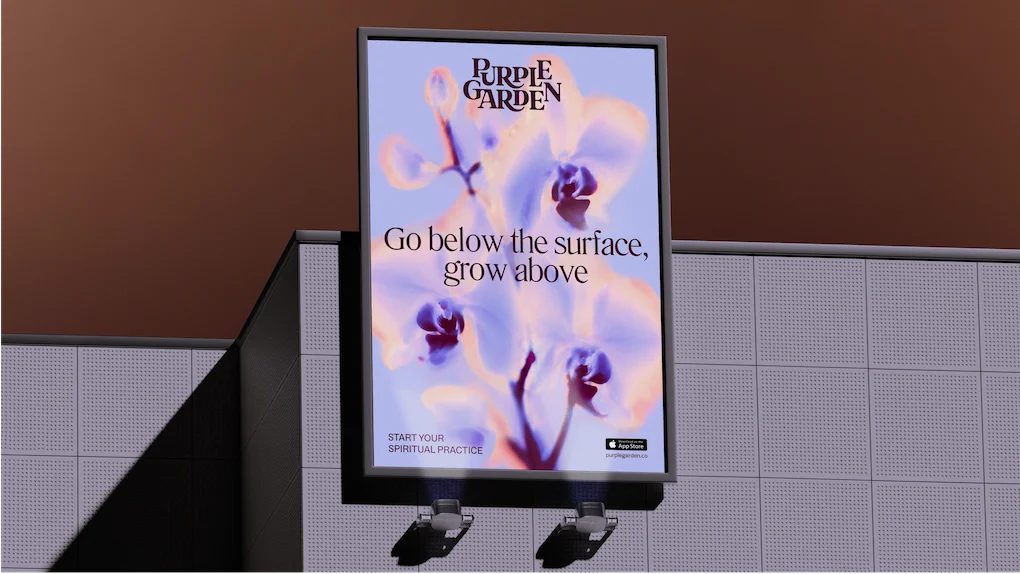
The intersection of commercial branding and intangible spiritual services has long presented a unique conceptual puzzle for creative agencies. When psychic services platform Purple Garden set out to overhaul its visual and verbal identity, it partnered with acclaimed global creative agency Mother Design to spearhead the transformation. Rather than relying on standard corporate brainstorming sessions or conventional market research metrics, the creative team opted for a radically immersive approach. Incorporating practices such as chakra readings, automatic drawing, and group séances, the resulting rebrand breaks conventional design paradigms, offering a serene, deeply authentic identity tailored specifically to seasoned seekers of spiritual guidance.
Background and Context of the Spiritual Services Market
The global wellness, spirituality, and esoteric services market has experienced a significant digital migration over the past decade. Platforms offering remote tarot readings, astrology, dream analysis, and holistic consultations have transitioned from niche fringe markets into mainstream digital ecosystems driven by apps and web services. Within this competitive digital landscape, platforms frequently fall back on predictable, highly saturated visual tropes. Common industry clichés include mystical purple gradients, stereotypical crystal ball iconography, and high-pressure marketing tactics that urge consumers to "book fast" or "get answers now."
Purple Garden, aiming to cement its position as an undisputed leader in the category, recognized the need to elevate its market presence. However, leadership understood that modern consumers—particularly seasoned individuals deeply familiar with spiritual practices—can easily spot inauthentic branding. To build genuine trust and establish a sophisticated marketplace authority, the platform needed an identity that respected the depth of its offerings while shedding cheap commercial clichés. This business objective set the stage for Mother Design’s unconventional intervention.
The Immersive Creative Process: A Paradigm Shift in Branding
Under the framework of Mother Design’s internal "Wild Card" initiative—a program designed to push creative boundaries and encourage experimentation with unfamiliar disciplines—the agency integrated a holistic practitioner from Purple Garden directly into the workflow. The objective was to translate abstract, unseen psychic forces into concrete visual and verbal assets.
The chronology of the project began with a deliberate step away from digital screens and standard mood boards. The cross-functional team, which included designers both experienced and entirely new to spiritual practices, participated in structured group workshops. Utilizing traditional tools like charcoal and paper, the designers engaged in automatic drawing and writing exercises. Inspired historically by Hilma af Klint and The Five—a pioneering group of early 20th-century women artists who utilized trance states to bypass conscious thought—the Mother Design team sought to tap into a collective, intuitive consciousness.
Jo Tulej, Creative Director at Mother Design, emphasized the vulnerability required during the early phases of the project. "The word ‘séance’ comes from sitting or session," Tulej noted. "It was slow, unclear, and required a lot of trust. By protecting this time and removing a traditional KPI from the output, I believe it gave our client a much richer, robust output that is deeply sensitive to the category and its audience."
Following the initial immersive sessions, the team paused for several days before returning to analyze the resulting marks, textures, and written pieces. These spontaneous physical creations served as the foundational building blocks for Purple Garden’s new visual architecture.
Visual and Verbal Identity: Balancing Whimsy with Grounded Authority
The finalized rebrand manifests as a masterclass in nuanced design, meticulously balancing ethereal qualities with commercial legibility.
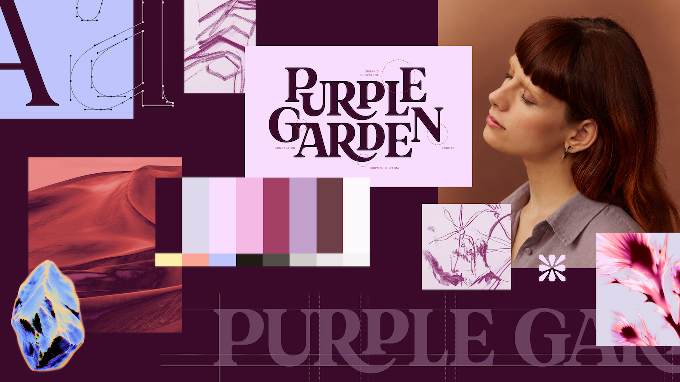
At the core of the visual system is a custom wordmark. Rather than static lettering, the typography features elegant serifs combined with curved junctures that visually emulate sprouting and organic growth. This symbolizes the core concept of "Living Practice," reflecting continual personal development and spiritual evolution. Paired with a digital-first, crystal-like glyph, the visual marks position Purple Garden as a stable source of grounded guidance rather than a fleeting digital novelty.
Typography plays a critical role in bridging the gap between whimsy and practical utility. The agency selected Literatura Present and ABC Social typefaces, which offer high legibility while maintaining a sophisticated, approachable tone.
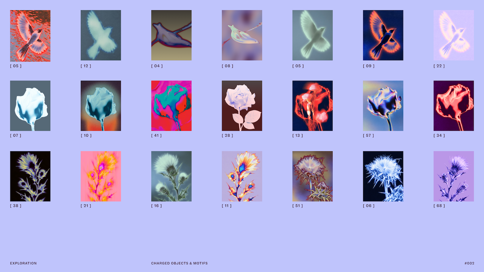
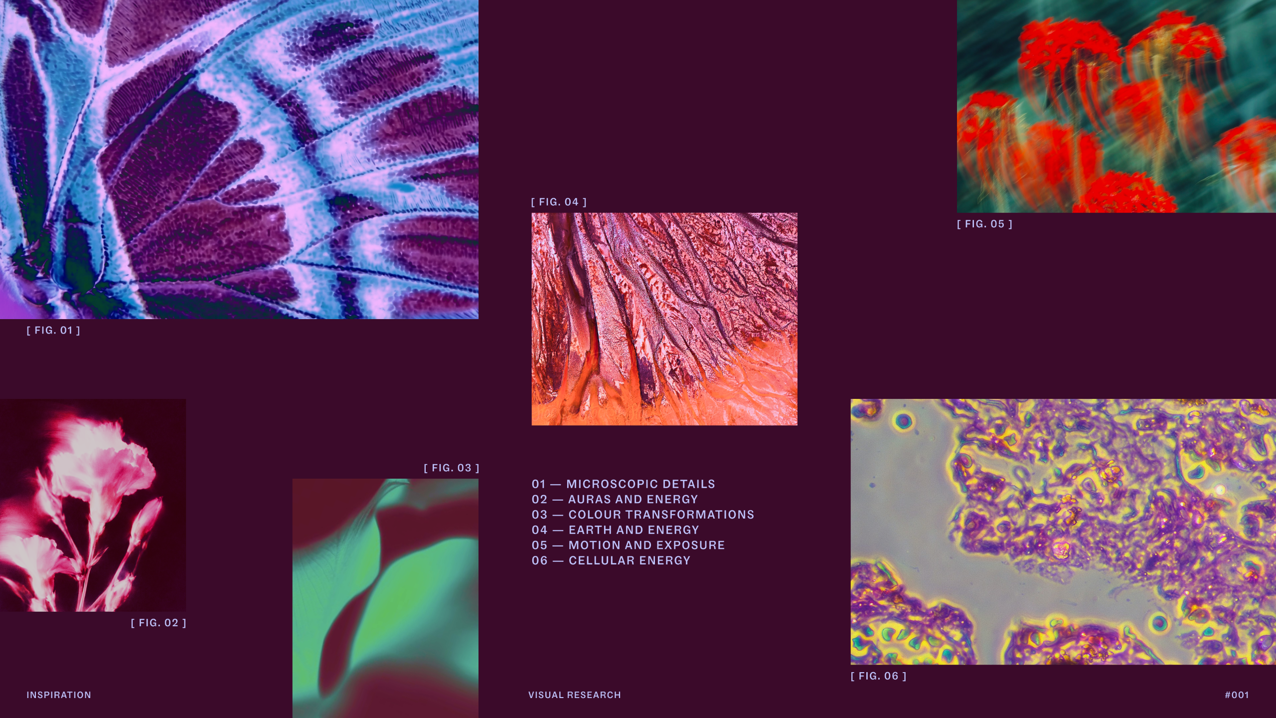
In terms of imagery, the platform moved away from flat, generic stock photography. Instead, the brand utilizes diverse imagery capturing "charged objects" that represent services such as dream analysis and intuitive readings. These images are treated with solarised glows and flame-like ripples, effectively visualizing the energy exchange between practitioner and client. While the brand retains a nod to its namesake through rich purples, the color palette has been expanded into an earthier spectrum of seven distinct hues, allowing the brand to stand out against the flatter, monotonous tones traditionally found in the esoteric sector.

The verbal identity underwent a similar strategic overhaul. Mother Design discarded high-pressure industry tropes in favor of a messaging framework built around "Active Contemplation." This dual-toned voice meets users at their specific emotional juncture—capable of offering gentle forward guidance during moments of transition or slowing down to accommodate reflective introspection.
Implications and Broader Impact on the Design Industry
The successful rollout of the Purple Garden rebrand—alongside Mother Design’s concurrent work on fellow psychic platform Keen—highlights a growing trend in modern branding: hyper-targeted audience immersion. By deeply understanding the psychological and cultural nuances of niche consumer bases, agencies can construct robust brand ecosystems that avoid superficial pastiche.
For the design industry at large, the Purple Garden project serves as a compelling case study on the value of protecting experimental, non-linear phases within tight commercial timelines. While agencies are frequently pressured to streamline deliverables and prioritize immediate key performance indicators, the project demonstrates that investing time in abstract exploration can yield commercially resilient and critically praised results.
As digital wellness platforms continue to mature, the standard set by Purple Garden and Mother Design suggests that future branding within esoteric and holistic markets will increasingly prioritize authenticity, emotional resonance, and sophisticated craftsmanship over transient digital gimmicks.