
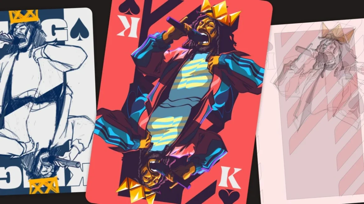
The seemingly simple design of a deck of playing cards presents a complex canvas for creative expression, demanding a delicate balance of familiar iconography and storytelling within a confined space. For illustrator Pope Phoenix, this challenge became the perfect vehicle to explore the rich history, vibrant energy, and distinctive visual language of hip-hop. Commissioned by Affinity, a leading graphic design software company, Phoenix embarked on a project to reimagine a standard playing card deck, aiming to infuse it with the essence of hip-hop culture, with the ultimate goal of producing a tangible product. The result, titled "King of Spades," masterfully reinterprets the concept of a royal flush, aligning it with the four foundational pillars of hip-hop: MCing, DJing, Breaking (or B-boying), and Graffiti. This innovative approach transforms a traditional game into a vibrant tribute to a global cultural phenomenon.
The Genesis of a Hip-Hop Playing Card Deck
The initial brief from Affinity was open-ended, inviting designers to conceptualize a playing card deck that could potentially be manufactured. For Pope Phoenix, a New York-based illustrator known for his emotionally resonant portraits and editorial work that delves into identity, culture, and storytelling, this presented a unique opportunity. His past clients include notable organizations such as IBM, BET, ESSENCE, and PBS, and this project further cemented his reputation for innovative visual narratives, especially within the context of Affinity’s creative collaborations.
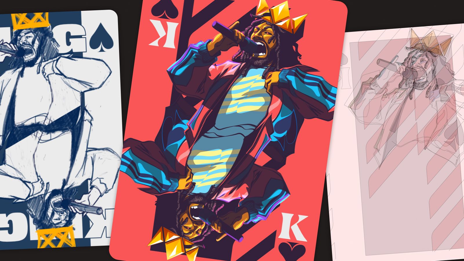
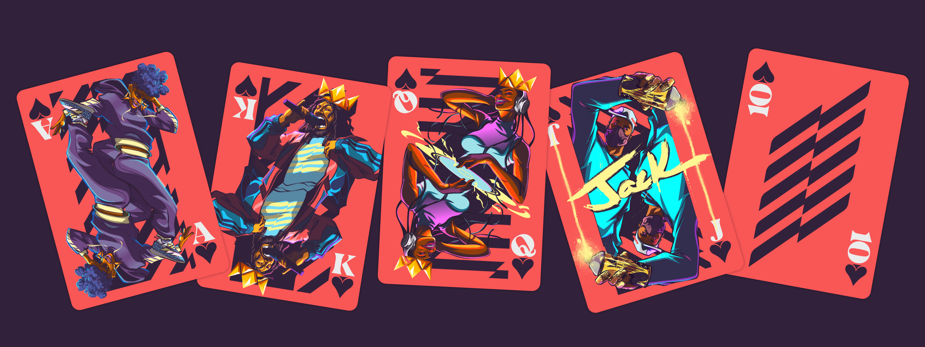
Phoenix’s conceptual journey began with a convergence of several thematic threads: Afrofuturism, the broader landscape of hip-hop culture, and a visual aesthetic inspired by the regal imagery of a Wakanda-esque royal family. The decision to concentrate the artistic effort on the face cards (Ace, King, Queen, Jack) was strategic, providing the most impactful platform to showcase his distinctive illustration style. This led to the development of the "royal flush" concept, reimagined through the lens of hip-hop’s core elements. The project would ultimately encompass four face cards, a single number card (the 10), and a custom back design, forming a cohesive visual system.
The genesis of this project can be traced back to early 2023, when Affinity, known for its user-friendly yet powerful design software like Affinity Designer, sought to collaborate with artists to push creative boundaries. The open brief aimed to uncover unique applications for their software and to foster a community of artists by potentially bringing their digital creations into the physical realm. Phoenix, already a proficient user of Affinity Designer, saw this as an ideal synergy between his artistic vision and the capabilities of the software.
Research and Ideation: Laying the Foundation
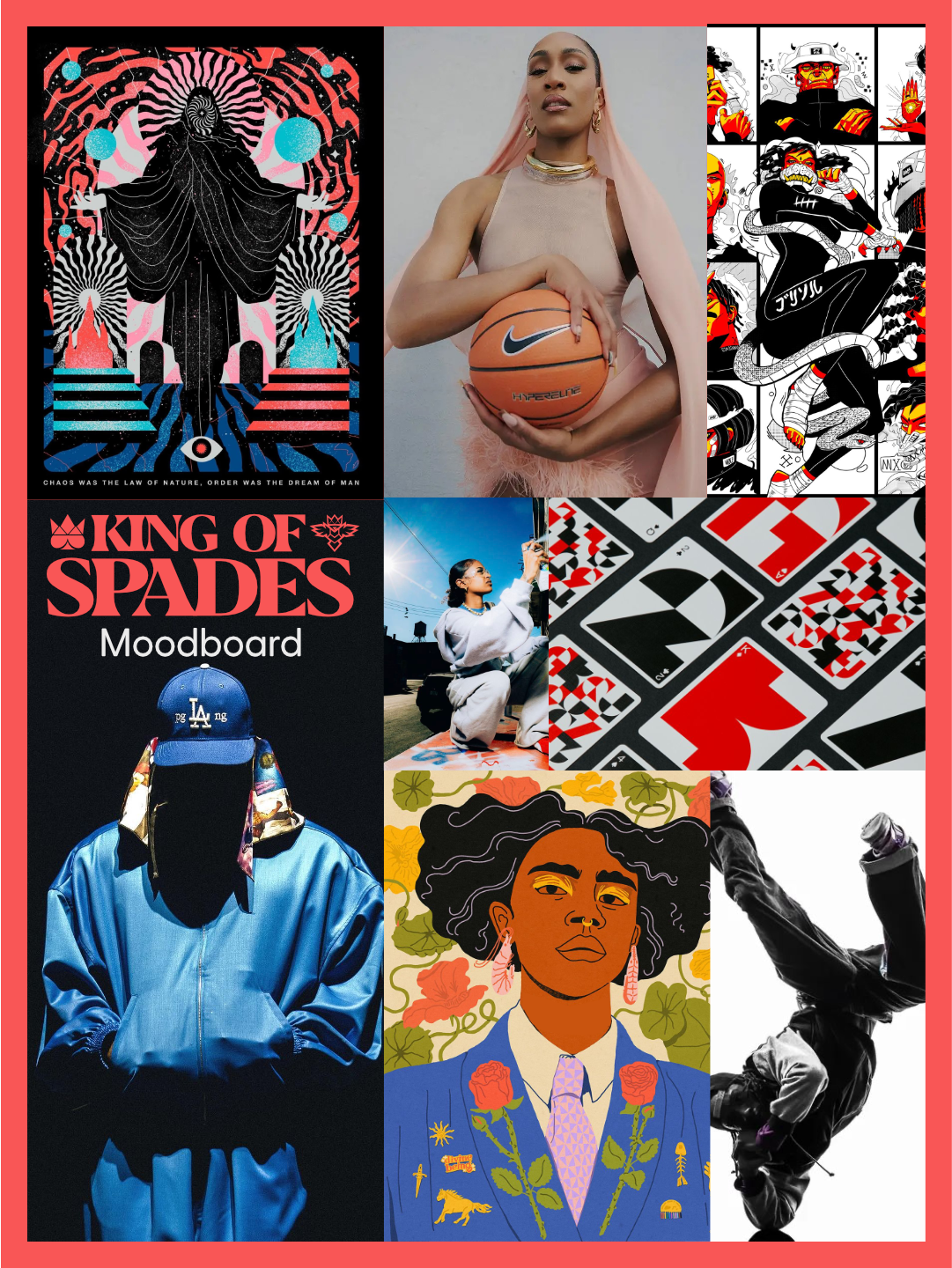
The foundational stage of the "King of Spades" project was characterized by rigorous research and thoughtful ideation. Phoenix immersed himself in the visual lexicon of hip-hop, meticulously gathering references that spanned decades of the genre’s evolution. This included iconic imagery from early graffiti artists who transformed urban landscapes into vibrant canvases, the dynamic movements of B-boys and B-girls, the influential sounds and styles of legendary DJs, and the lyrical prowess of pioneering MCs. Simultaneously, he delved into the historical and structural conventions of traditional playing card decks. This dual focus was crucial: understanding the established framework of a playing card was essential for ensuring the deck’s functionality, while absorbing the visual language of hip-hop provided the raw material for its unique identity.
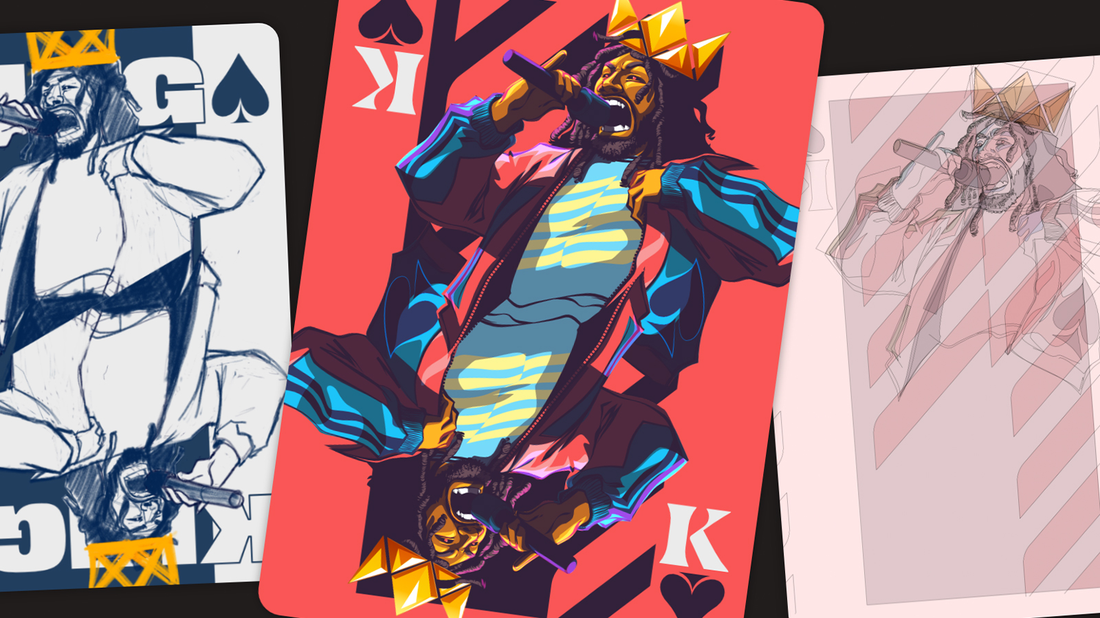
The name "King of Spades" itself emerged during this phase, deemed fitting for a project that aimed to elevate hip-hop culture to a position of prominence, akin to royalty within the deck’s hierarchy. The core concept – translating the four pillars of hip-hop into the structure of a royal flush – became the guiding principle. This involved contemplating what constitutes a successful playing card design, considering factors beyond mere aesthetics, such as legibility, playability, and the inherent narrative embedded within each card.
One of the primary challenges identified early on was the integration of symbolism and cultural references without overwhelming the functional requirements of a playing card. Phoenix’s approach of leaning into the traditional playing card format was a deliberate choice. This allowed the illustrations to function effectively within the established rules of card games, while simultaneously providing ample creative freedom to develop the distinct visual identity of each character. The mirrored face card structure, a standard feature in most decks, proved particularly advantageous. This ensured that the cards remained readable and recognizable regardless of how they were held or played, a critical consideration for a functional deck. Ultimately, the decision to adhere to a traditional flipped-card layout, rather than opting for more experimental compositions, significantly strengthened the deck’s overall coherence and practical usability.
Developing the Visual Language: From Thumbnails to Vector Art
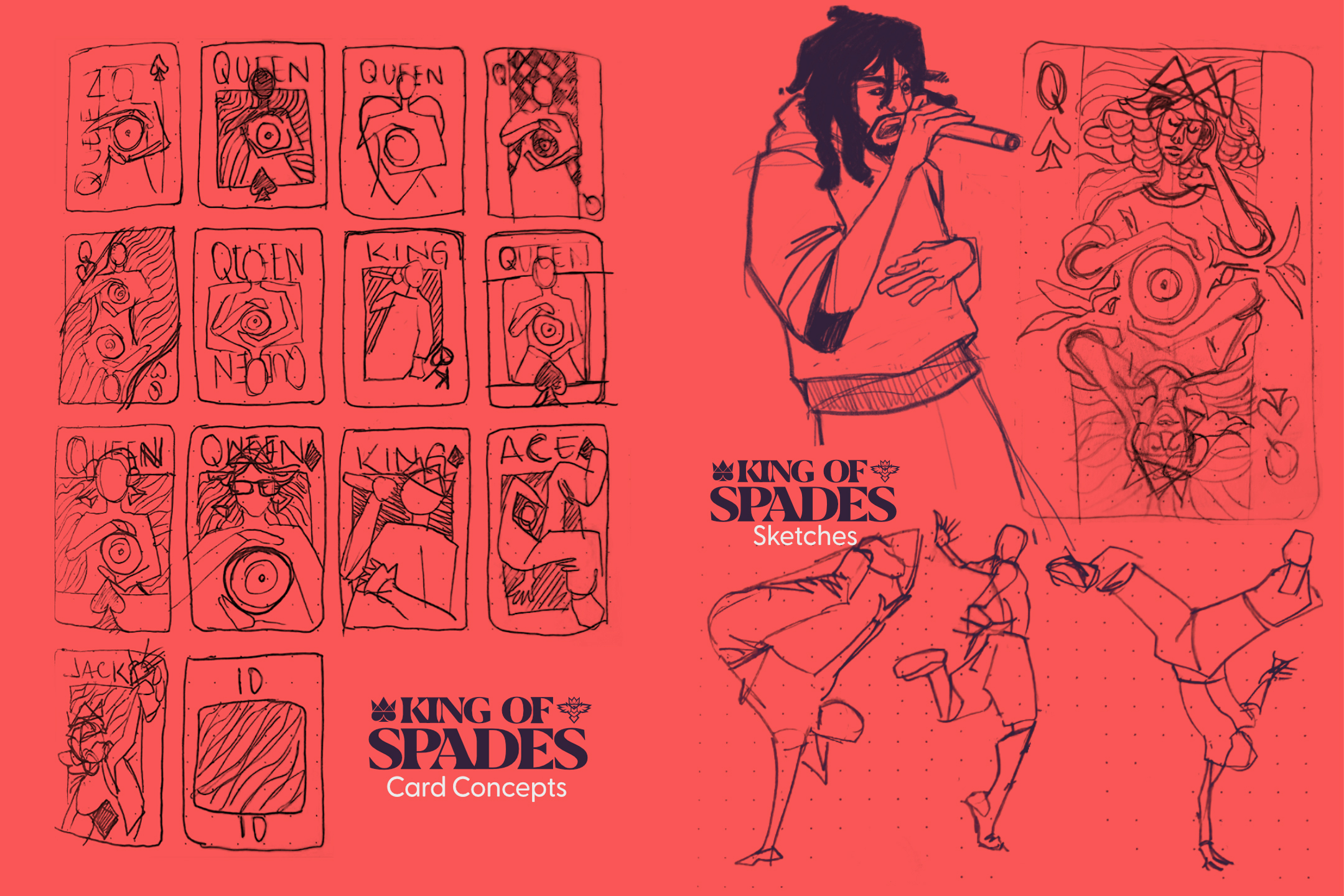
The creative process moved into the crucial phase of translating abstract ideas into tangible visual elements. This began with the creation of numerous thumbnail sketches, a rapid-fire exploration of various compositions and character interpretations. This iterative process allowed Phoenix to quickly assess and refine different visual pathways, discarding less effective concepts and honing in on those that best captured the spirit of hip-hop and the constraints of the playing card format.
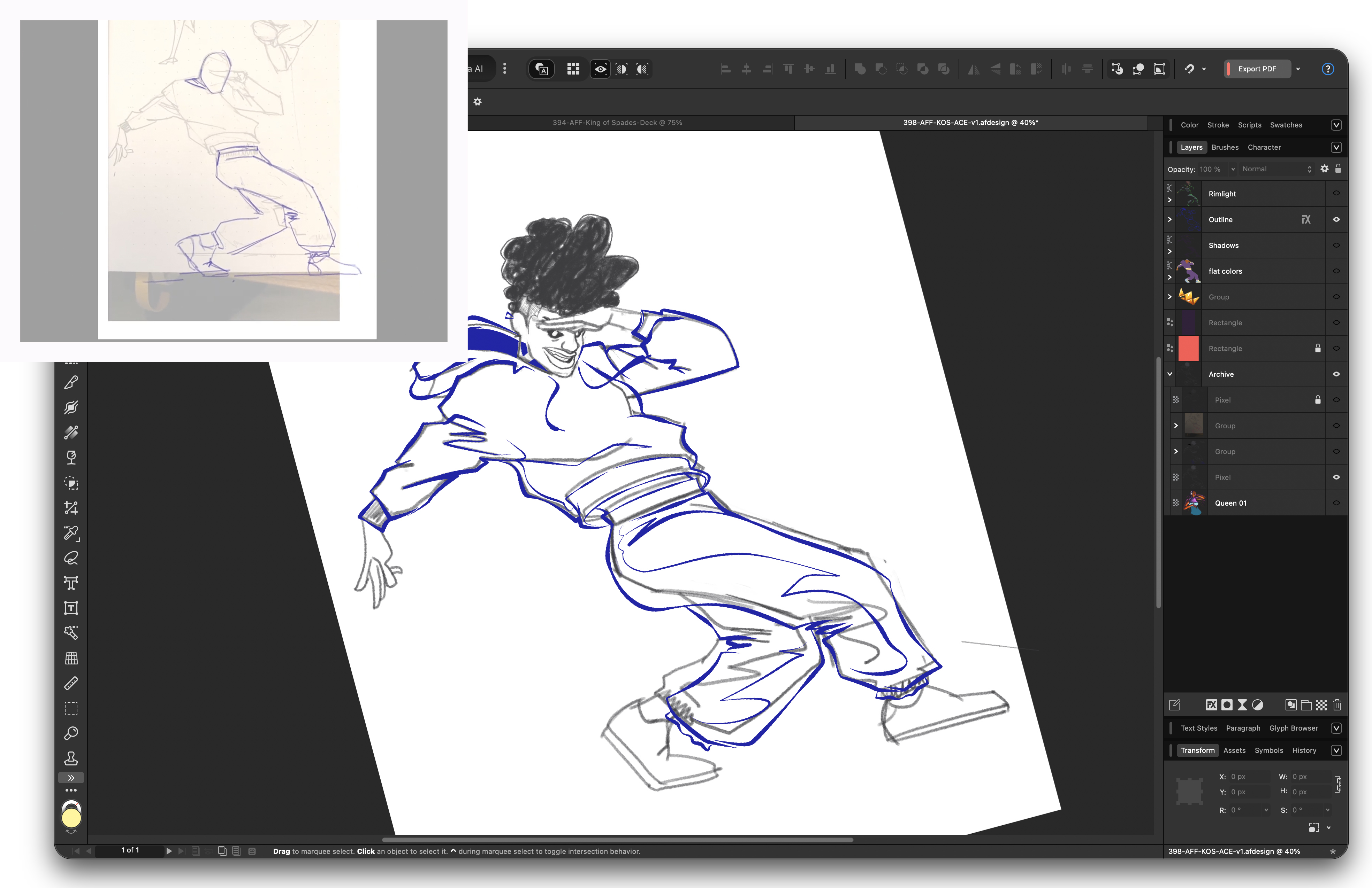
The transition from rough sketches to polished vector illustrations was undertaken using Affinity Designer. This stage involved meticulously refining the initial drawings, employing raster pencil brushes to imbue the artwork with a sense of organic texture and depth. These refined sketches served not as final renderings, but as foundational blueprints, allowing for continued evolution of the illustrations throughout the design process.
A significant technical hurdle encountered was ensuring the visual integrity of the illustrations when flipped. This required a constant awareness of how shapes, poses, and intricate details would interlock and remain coherent when mirrored. Phoenix acknowledged that the initial concept and its final execution rarely align perfectly. Each illustration demanded iterative adjustments as the overall system of the deck developed. This meticulous attention to detail was paramount in creating a unified and functional set of cards.
Once the fundamental system for mirroring and alignment was established, the process of refining the artwork became more streamlined. This allowed for the development of cleaner, more concise visual presentations while ensuring that the narrative embedded within each card remained intact. The choice of Affinity Designer proved instrumental in this phase, offering the precise control and flexibility required for intricate vector illustration and seamless integration of raster elements.
Coloring the Culture: A Vibrant Palette
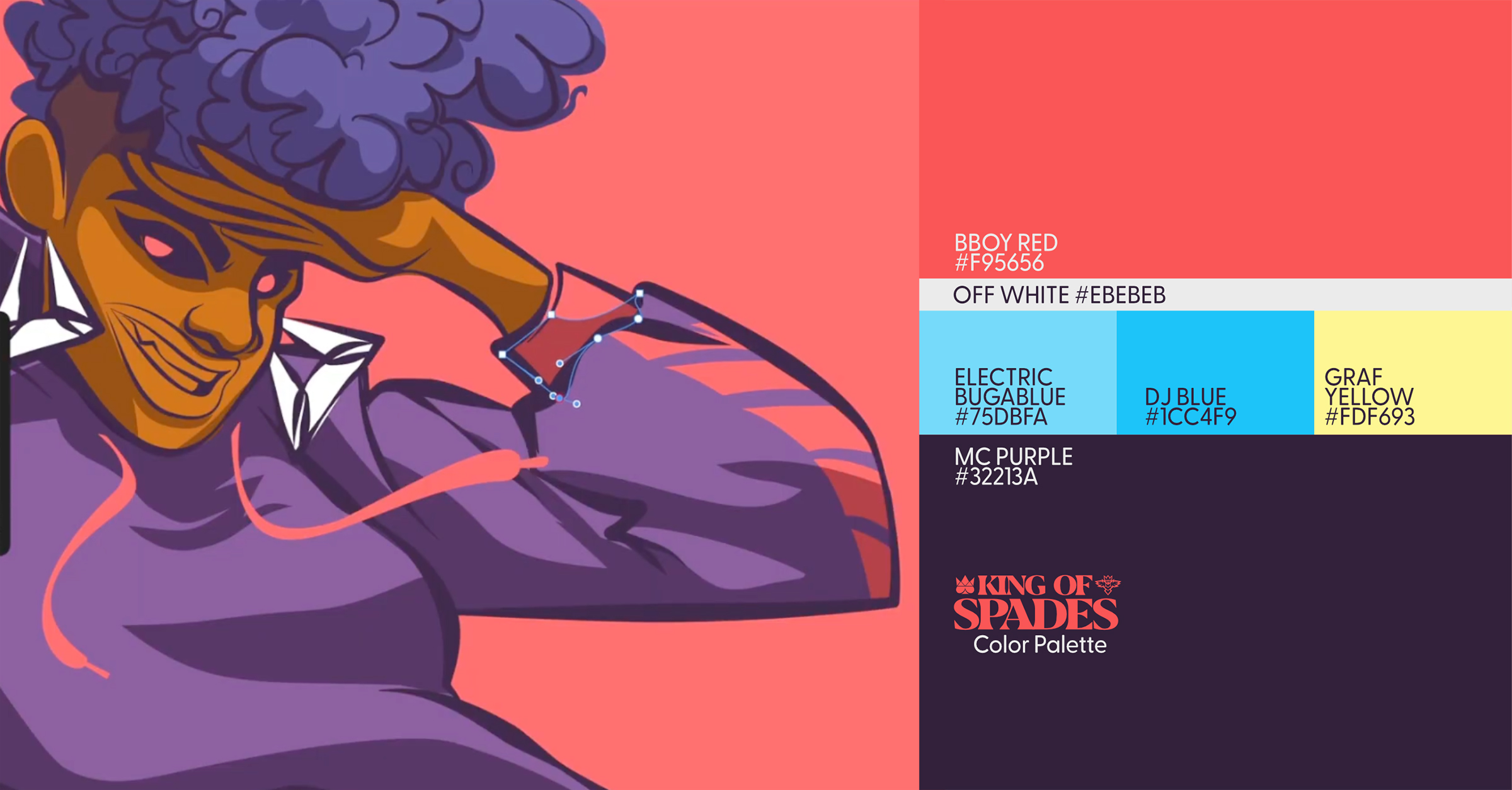
The selection of colors for the "King of Spades" deck was a deliberate act of translating the palpable energy and vibrancy of hip-hop into a visual language. Phoenix aimed for a palette that felt bold, dynamic, and intrinsically linked to the genre’s spirit. The color scheme began to coalesce organically during the creation of the King card and became more refined as he progressed through the rest of the deck.
At the heart of the palette lies a rich, mid-luminosity red, which, when viewed in isolation, might appear somewhat muted. However, its true vibrancy is unlocked when juxtaposed with its complementary color: a deep, moody purple. This primary pairing establishes a striking visual tension and depth. Accompanying these are two secondary colors – a subdued yellow and a vivid blue – which provide additional layers of contrast and harmony. An electric blue is employed for subtle highlights, adding a touch of luminescence, while an off-white serves as the anchor for typography and graphic details, ensuring clarity and readability.
Phoenix approached the coloring process with the same meticulousness he would apply to traditional illustration. Color was employed not merely for aesthetic appeal, but as a strategic tool to create balance, depth, and emphasis across the entire deck. This nuanced understanding of color theory contributed significantly to the overall impact and visual coherence of the "King of Spades" collection. The chosen palette evokes the raw, urban aesthetic often associated with graffiti art, the energetic performances of breakdancers, and the bold statements made by MCs and DJs.
Bringing the Pillars to Life: The Face Cards
The culmination of Phoenix’s efforts is most vividly displayed in the design of the face cards, each meticulously crafted to represent one of hip-hop’s foundational pillars.
-
The King of Spades (MCing): This card embodies the lyrical prowess and commanding presence of the Master of Ceremonies. The character depicted exudes confidence and authority, perhaps holding a microphone or gesturing as if in mid-flow. The design likely incorporates elements that symbolize storytelling, wordplay, and the power of spoken word. The visual cues could include stylized representations of lyrics, sound waves, or iconic hip-hop fashion elements that denote lyrical mastery.
-
The Queen of Spades (DJing): Representing the art of the DJ, this card showcases the technical skill and sonic artistry involved in spinning records. The Queen might be depicted with turntables, a mixer, or headphones, her movements fluid and precise as she manipulates sound. Elements such as vinyl records, equalizer bars, or abstract representations of soundscapes could be incorporated to emphasize her role as a sonic architect. The Queen’s portrayal likely conveys a sense of rhythm, control, and the ability to orchestrate an atmosphere.
-
The Jack of Spades (Breaking/B-boying): This card captures the explosive energy and athletic dynamism of breakdancing. The Jack is shown in a gravity-defying pose, perhaps mid-freeze, power move, or footwork sequence. The illustration would emphasize fluidity, strength, and agility. Visual elements such as dynamic lines suggesting movement, urban street elements like concrete or fire escapes, and perhaps even stylized spray paint effects could be integrated to convey the raw, street-born nature of this pillar.
-
The Ace of Spades (Graffiti): As the most significant card in many games, the Ace serves as a powerful representation of graffiti art. This card could feature a central motif that evokes the iconic style of graffiti lettering, perhaps incorporating bold outlines, vibrant fills, and elaborate tags. The background might resemble a spray-painted wall or a cityscape, underscoring the urban origins and artistic rebellion associated with this pillar. The Ace embodies creativity, visual impact, and the transformation of public spaces into artistic statements.
Beyond the individual characters, Phoenix also focused on integrating symbolic elements that resonate with each pillar. For instance, the King might have subtle nods to lyrical metaphors, the Queen could be surrounded by visual representations of beats and samples, the Jack’s pose might suggest the urban environment where breaking thrives, and the Ace would undoubtedly feature elements reminiscent of classic graffiti styles. The overall composition of each face card ensures that when viewed together, they form a cohesive narrative, celebrating the interconnectedness of these four pillars within the broader hip-hop culture.
Beyond the Face Cards: The Number 10 and Back Design
The design of the "King of Spades" deck extends beyond the face cards to encompass the number card and the back design, ensuring a unified and impactful aesthetic.
-
The Number 10 Card: This card underwent several iterations throughout the project, reflecting Phoenix’s ongoing exploration of how to best represent the overarching themes. Initially, it featured simple dot systems, a nod to traditional number card design. Subsequently, it evolved to incorporate bass line-inspired graphics, aiming to connect with the musicality inherent in hip-hop. The final design for the number 10 card serves as a bridge between the intricate artwork of the face cards and the more patterned back design, likely incorporating subtle visual cues that echo the project’s core themes without overpowering the primary illustrations.
-
The Card Back Design: Creating the card backs presented a significant design challenge, as Phoenix aimed for them to possess as much visual impact as the face cards. The solution ultimately emerged from transforming elements of an MPC (Music Production Center) graphic into a repeating pattern. This involved strategically rotating and flipping design elements at various angles, allowing portions of the design to extend beyond the clipping mask on the back. This technique creates a dynamic and visually engaging pattern that is both intricate and cohesive. Furthermore, the number graphic was ingeniously incorporated into the back design, not as a dominant element, but as a subtle addition that complements the overall composition without detracting from the repeating MPC motif. The back design, therefore, serves as a powerful visual signature for the entire deck, encapsulating the production and sonic aspects of hip-hop culture.
Technical Refinements and Artistic Touches
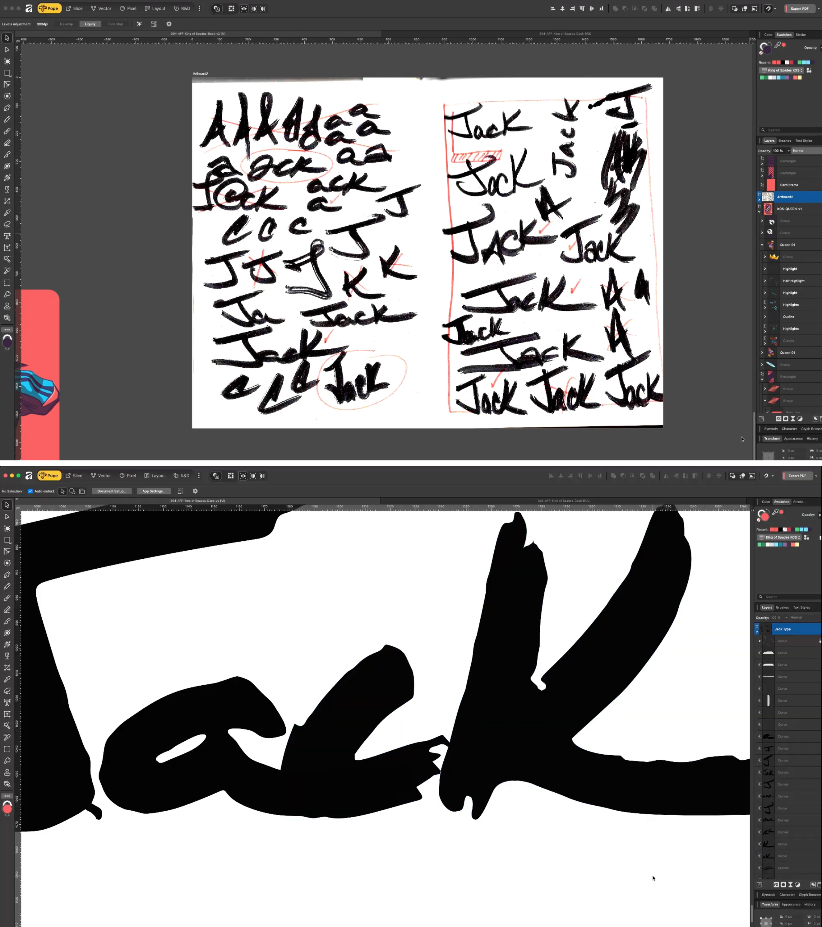
The project also saw a focus on adding specific artistic touches that further enhance the deck’s authenticity and visual appeal. The lettering for the Jack card, for instance, was developed directly from sketches rather than relying on pre-existing typefaces. To achieve a uniquely gritty and expressive quality, Phoenix modified a Tombow marker by using a razor to roughen the nib. This technique, inspired by the work of artist James Victore, imparted an imperfect, hand-drawn aesthetic that perfectly suited the Jack’s representation of urban artistry.
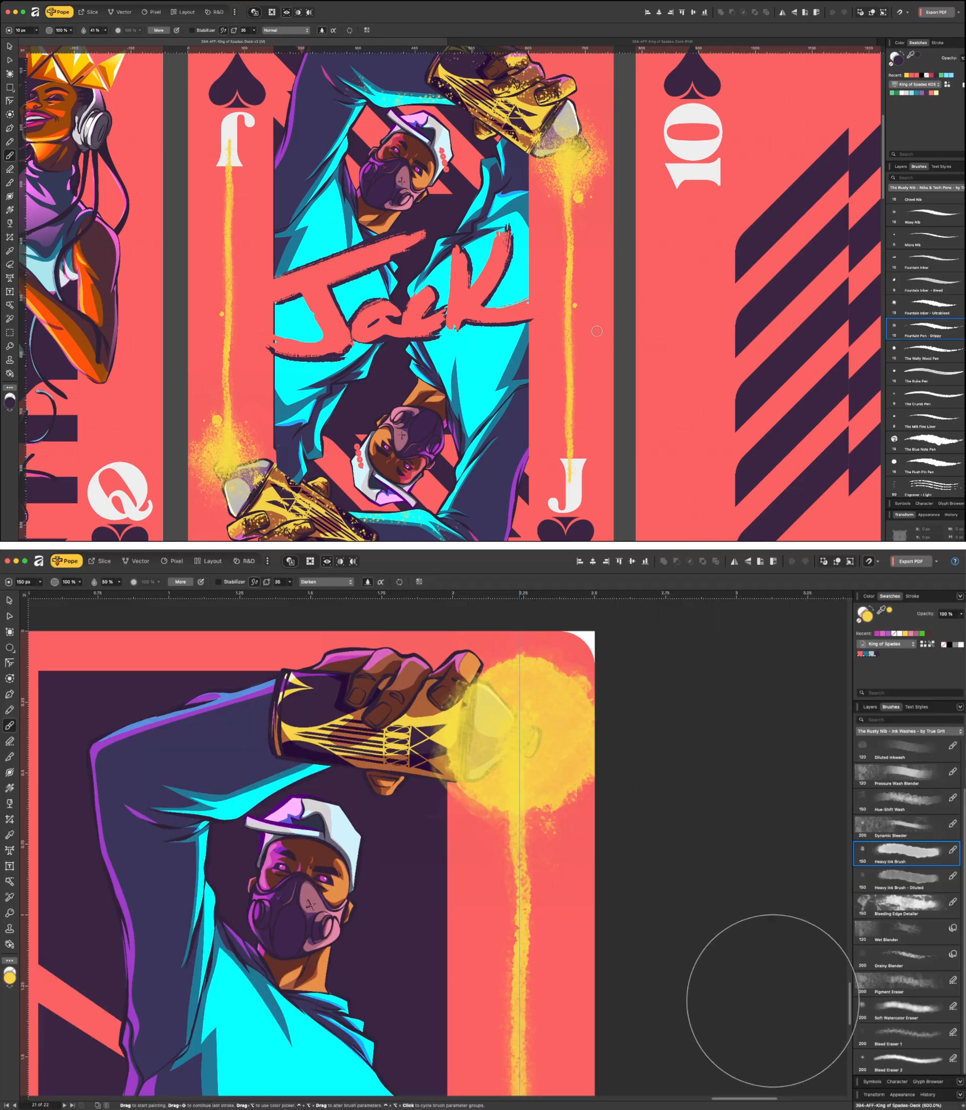
The desire to imbue the design with a sense of raw, authentic texture led Phoenix to explore spray paint effects. After considerable trial and error, he curated a collection of brushes from True Grit Texture Supply and utilized base sets to achieve the desired look. This final layer of detail helps to visually anchor the deck, imbuing it with the visceral, street-art sensibility that is fundamental to hip-hop culture.
Reflecting on the process, Phoenix identified a key learning for future projects of this nature: the implementation of a dynamic template system from the outset. By converting the final layout into an Affinity "Symbol," any adjustments made to the template would automatically propagate across all iterations of the project. This would significantly streamline the workflow, particularly when dealing with multiple variations and intricate design interdependencies.
Implications and Broader Impact
The "King of Spades" playing card deck represents more than just a visually stunning design project; it signifies a thoughtful and respectful engagement with hip-hop culture. By translating its core elements into a universally recognized format like playing cards, Phoenix has created a bridge between traditional art forms and contemporary cultural expressions. The deck serves as a testament to the enduring influence of hip-hop, not only as a musical genre but as a multifaceted artistic and cultural movement.
The project also highlights the evolving landscape of digital art and its potential for tangible product creation. Affinity’s role in enabling artists like Phoenix to bring their digital visions to life underscores the growing importance of user-friendly yet powerful design software in democratizing creative production. The potential for the "King of Spades" deck to become a physical product further emphasizes this trend, offering collectors and enthusiasts a unique piece of art that merges functionality with cultural significance.
The reception to such a project, while not explicitly detailed in the provided text, can be inferred to be positive within design and cultural circles. Projects that successfully blend established design principles with vibrant cultural narratives often garner attention for their innovation and artistic merit. The "King of Spades" deck stands as a compelling example of how design can be used to celebrate, interpret, and disseminate the rich tapestry of global cultures, making it accessible and engaging for a wider audience. It is a project that not only showcases the talent of Pope Phoenix but also reaffirms the power of design to tell stories and connect people through shared cultural touchstones.
