
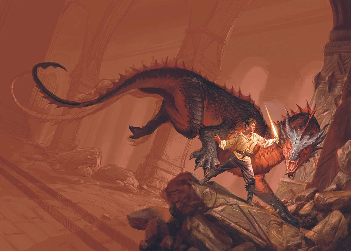
Commissioned by publishing house Armenia Edizioni, digital artist and illustrator teams have increasingly turned to classic epic fantasy tropes to establish immediate visual narratives for debut authors. The project centered on creating a striking cover for the debut fantasy novel by author RF Obsydios, requiring a meticulous blend of traditional aesthetic influences, advanced digital rendering techniques, and strict adherence to editorial art direction.
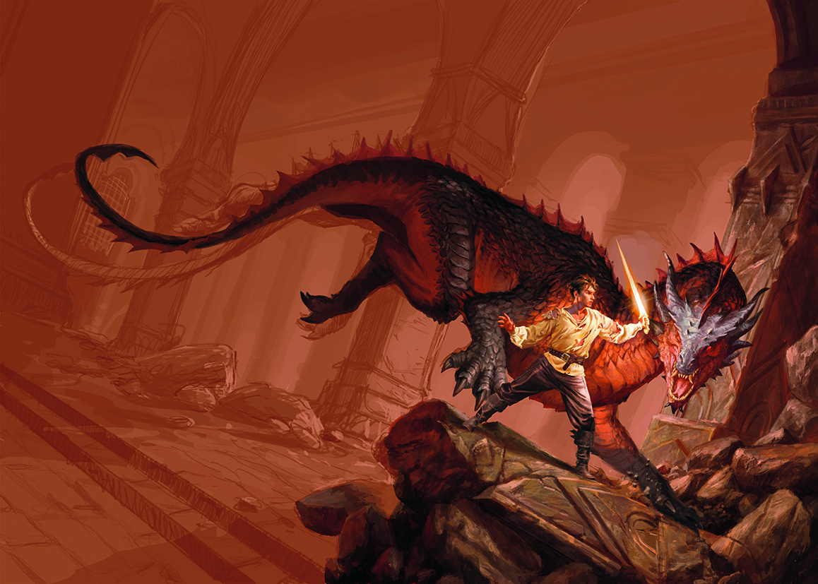
The commission called for a specific dramatic tableau: a young warrior, bearing the visible physical toll of intense combat with a torn shirt and battle scars, defiantly brandishing a sword against a massive, wingless dragon. The creature, covered in dense scales shifting between deep shades of red and black, was to be set within an imposing, gloomy fortress defined by cavernous vaulted columns and the rubble of recent destruction.
This comprehensive look at the production pipeline details how the artist translated these narrative requirements into a published book cover, navigating conceptual sketching, figure isolation, anatomical challenges, and environmental texturing.
Conceptual Foundations and Editorial Direction
The stylistic framework for the cover was heavily rooted in the traditions of classic epic fantasy illustration. Drawing inspiration from the works of master illustrators of previous decades, the art team established a warm color palette dominated by rich reds and vibrant oranges. This tonal guidance was explicitly modeled after modern dark fantasy benchmarks, such as Joe Abercrombie’s acclaimed novel The Devils, which serves as a contemporary touchstone for gritty, high-stakes speculative fiction.
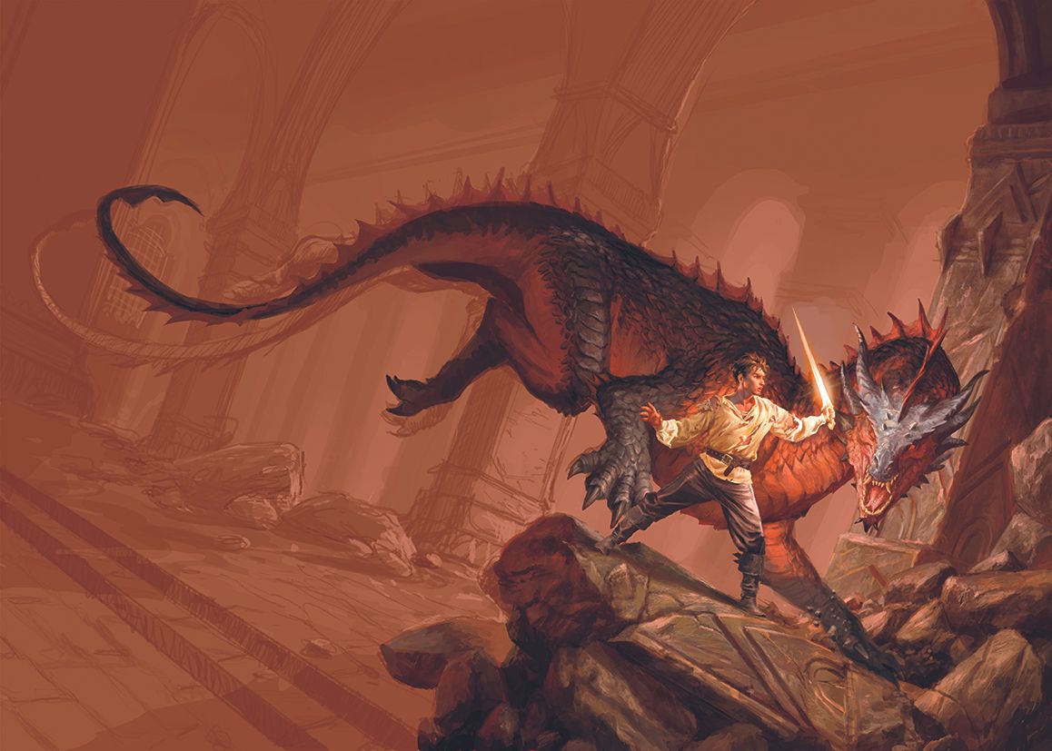
In modern publishing, cover art functions as a vital marketing instrument designed to capture reader attention in an increasingly crowded literary marketplace. According to publishing industry data, over 65% of fiction readers cite book cover aesthetics as a primary factor influencing their purchasing decisions. For a debut author like RF Obsydios, establishing an unmistakable genre identity through the cover artwork is crucial for securing initial shelf space in bookstores and driving digital conversions across online retail platforms.
Phase One: Sketching and Composition
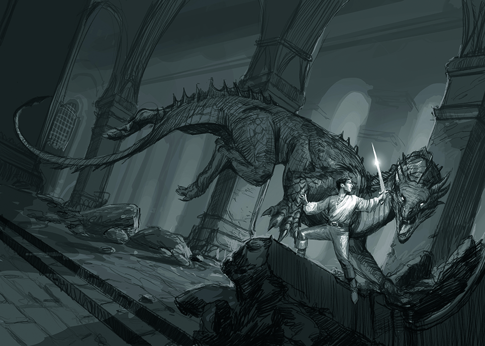
The production workflow began with conceptual planning rather than exhaustive drafting. Esheding the practice of generating numerous preliminary concepts, the artist produced only one or two black-and-white sketches. The primary objective of this initial phase was to communicate compositional intent, lighting dynamics, and volume to the stakeholders at Armenia Edizioni efficiently.
By establishing clear focal points and a deliberate distribution of light and shadow early in the process, the illustrator minimized the need for major revisions later in the pipeline. This approach aligns with standard industry practices where tight coordination between the publisher and the artist during the thumbnail stage prevents costly redesigns after rendering has commenced. Industry surveys indicate that early-stage alignment accounts for approximately 80% of a project’s overall visual success, ensuring that authors, editors, and art directors share a unified vision before fine details are introduced.
Phase Two: Figure Painting and Isolation
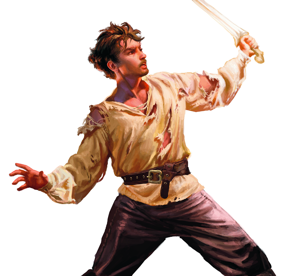
A critical technical choice in the creation of the cover involved the separation of the human subject from the broader architectural and fantastical elements. The young warrior was painted independently on a larger digital canvas to allow for meticulous attention to anatomical detail, texture on the torn clothing, and the harsh lighting reflecting off the blade and skin.
Once the figure was rendered to a high level of finish, it was resized and composited into the master scene. This technique, facilitated by modern digital art software suites running on professional drawing tablets, affords artists greater control over fidelity and edge definition. Isolating key narrative elements prevents background bleed and ensures that the central protagonist commands the viewer’s immediate visual attention, a vital requirement given the small thumbnail format in which online shoppers frequently first encounter book covers.
Phase Three: Scene Construction and Anatomical Challenges
With the warrior positioned, the broader environment—comprising the dragon, the collapsing fortress, and the accumulated debris of battle—was constructed. The artist noted that establishing spatial relationships early was essential to evaluate whether the composition functioned cohesively before committing to final rendering passes.
A particularly complex hurdle in this phase was designing the anatomy of the dragon’s hind legs. The objective was to infuse the massive creature’s posture with kinetic energy, creating a sweeping compositional curve that naturally guides the viewer’s eye back toward the central confrontation between the beast and the protagonist. Designing convincing fictional anatomy requires a deep understanding of weight distribution and muscular tension, drawing loose inspiration from real-world reptiles and mammalian predators to maintain biological plausibility within a fantastical context.
Environmental Texturing and Architectural Inspiration
The architectural backdrop of the scene was envisioned as a dark, gigantic fortress inspired heavily by classic subterranean ruins, specifically referencing the atmospheric scale of Moria. To convey the antiquity and structural decay of the setting, the artist focused heavily on the foreground elements, such as a fractured stone column.
The textured appearance of weathered stone was achieved through subtle color variations and specialized digital brush techniques mimicking "dry brush" traditional painting methods. Scratches, cracks, and moss accumulation were layered onto the stone surfaces to ground the fantastical narrative in a tangible, physical reality. Environmental storytelling through damaged architecture reinforces the high-stakes tone demanded by modern epic fantasy narratives.
Cinematic Angles and Reference Gathering
To amplify the psychological tension and perceived peril of the narrative moment, the artist employed a dynamic, tilted camera angle. In visual storytelling, Dutch angles or canted framing devices are standard techniques utilized to destabilize the viewer’s equilibrium, thereby heightening feelings of suspense, urgency, and dramatic impact.
Furthermore, the creation of accurate lighting and fabric behavior relied on tangible reference materials. Over years of practice, the illustrator has curated a collection of historical-style garments and fabric scraps. By setting up physical costumes and photographing them under controlled lighting conditions that mirrored the intended digital scene, the artist secured accurate visual references for how light wraps around torn cloth and bruised skin, bridging the gap between imagination and empirical observation.
Broader Implications and Industry Trends
The collaboration between Armenia Edizioni and independent digital illustrators underscores broader economic and artistic shifts within the global publishing sector. As independent and mid-tier publishing houses compete with major conglomerates, investing in high-caliber, bespoke cover art has become a primary differentiator. High-quality visual assets directly correlate with increased social media engagement, book trailer performance, and cross-border licensing interest.
As the fantasy genre continues to experience a renaissance driven by multimedia adaptations and an influx of new readership, the technical demands placed on digital illustrators have grown exponentially. Projects like the cover for RF Obsydios’s debut novel highlight the intersection of classical fine art training, advanced digital tooling, and strategic publishing logistics required to bring modern speculative fiction to market.
