
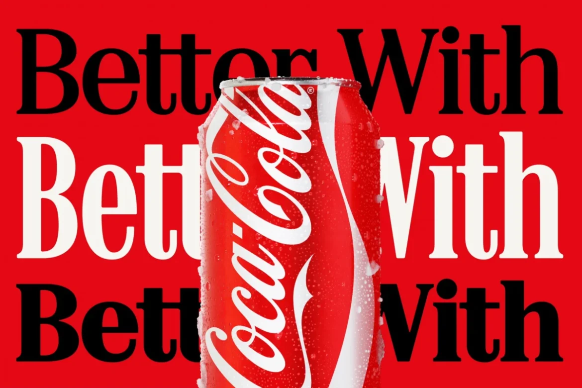
The global beverage giant Coca-Cola, in a significant move to refresh its brand identity, has unveiled a new typographic-focused design strategy, spearheaded by agency JKR. Central to this overhaul is the amplified prominence of the "Better With" typeface, a custom font family originally developed by Brody Associates in 2023 for a holiday campaign. This elegant serif font, now positioned at the core of Coca-Cola’s marketing and packaging initiatives, has inadvertently ignited a fervent online discourse due to its striking visual parallels with the iconic typography of Marlboro cigarettes. The juxtaposition of a widely consumed sugary drink with the branding of a notoriously addictive tobacco product has not gone unnoticed by the public, leading to a wave of commentary and speculation across social media platforms.
The "Better With" Typography: A Deeper Dive
Brody Associates, the design firm behind the "Better With" typeface, described their objective as crafting a font that "express[es] the brand’s unique personality, movement, and playfulness." They elaborated on their design process, stating, "Inspired by the company’s archive, we blended Coca-Cola’s rich serif font heritage with modern-day requirements, adding another layer of storytelling to the brand through typography." This intention was to evoke a sense of nostalgia while maintaining contemporary relevance, a common strategy in brand revitalisation. The typeface itself features a classic serif structure, characterized by its bold strokes and distinct embellishments, aiming to convey a sense of heritage and trustworthiness.
However, the execution of this vision has led to an unforeseen design convergence. While the "Better With" font is not an exact replica of the Marlboro typeface, the similarities are pronounced enough to be immediately apparent to many observers. Both fonts share a similar weight, stroke contrast, and a classic, somewhat retro aesthetic that harks back to mid-20th century design sensibilities. This visual kinship has become a focal point for online discussion, with many users drawing attention to the perceived irony of Coca-Cola adopting a style reminiscent of tobacco branding.
Public Reaction and Social Media Frenzy
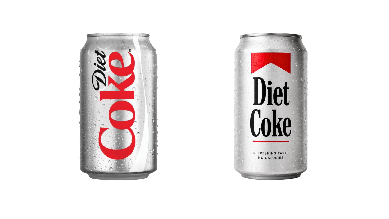
The online community was quick to react to the perceived resemblance. Platforms like X (formerly Twitter) became a hub for these observations, with users sharing mock-ups and witty remarks. One prominent post, featuring a fan-made image of a Diet Coke can adorned with Marlboro-style branding, garnered significant attention, encapsulating the sentiment shared by many. This image, circulated widely, highlighted the uncanny visual echo between the two distinct products.
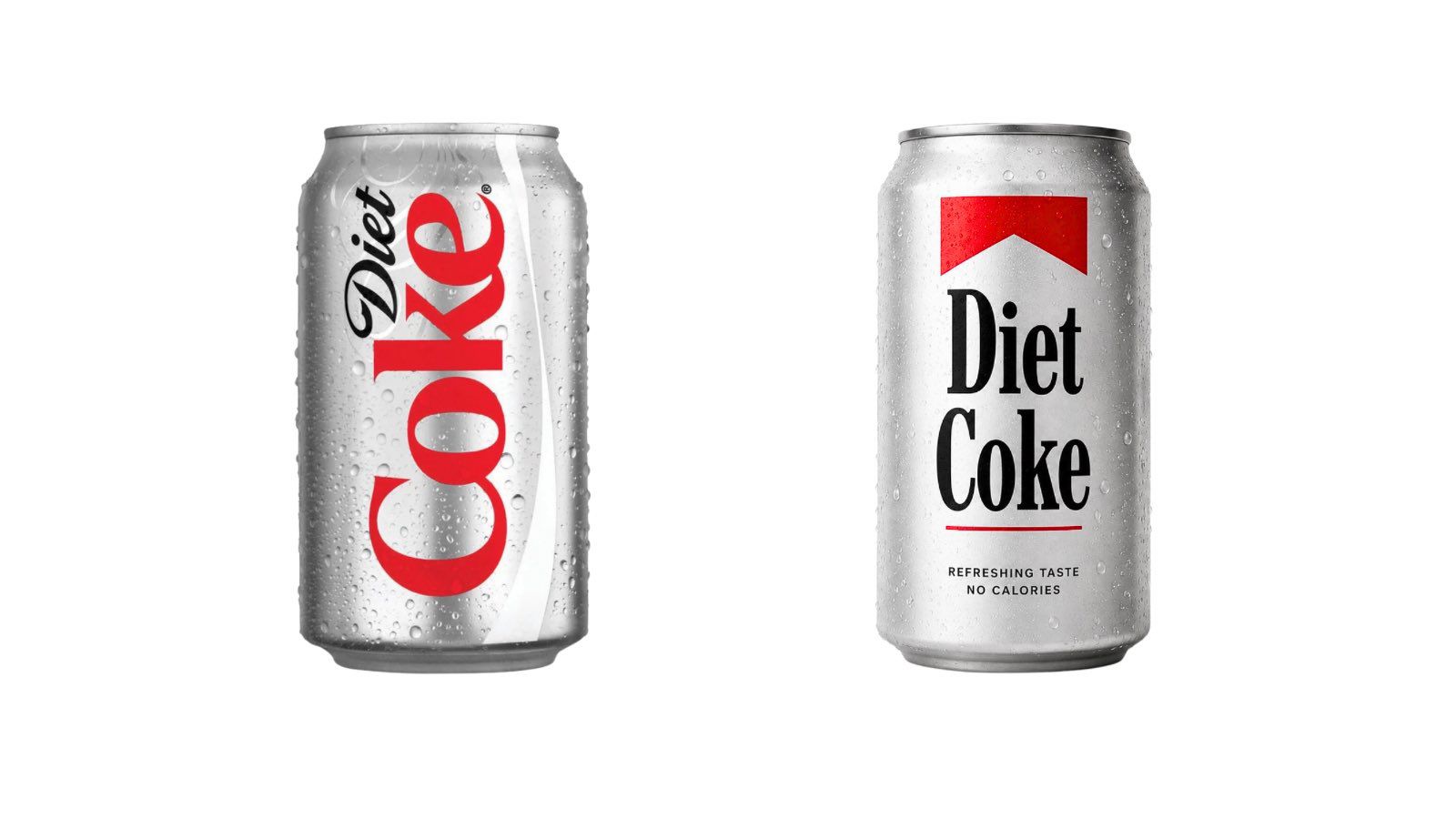
Commentary ranged from amusement to pointed critique. One user on X remarked, "Love that they just leaned into the fact that soda is the new cigarettes by just straight up doing the Marlboro font." This sentiment reflects a broader cultural commentary on the perceived health implications of both products and the potential for brands to inadvertently align themselves with unhealthy lifestyle choices. The "fridge cigarette" meme, which had recently gained traction on platforms like TikTok, describing Diet Coke as a substitute for a cigarette break, further fueled this narrative. Some interpreted Coca-Cola’s design choice as a subconscious or even intentional nod to this emerging cultural association.
The Historical Context of Branding and Health
The comparison between Coca-Cola’s new branding and Marlboro’s iconic look is particularly noteworthy given the evolving public perception and regulatory landscape surrounding both sugary drinks and tobacco products. For decades, tobacco companies, including Philip Morris (the manufacturer of Marlboro), employed sophisticated branding and marketing strategies to build brand loyalty and project an image of sophistication and masculinity. The Marlboro Man, for instance, became a potent cultural icon, symbolizing rugged individualism and freedom. The distinctive red and white packaging and the bold, classic serif font were integral to this successful, albeit controversial, branding.
In parallel, Coca-Cola has long been a master of global branding, leveraging its iconic red and white color palette and distinctive script logo to foster emotional connections with consumers worldwide. The company has often associated its products with happiness, togetherness, and refreshment. However, in recent years, the health implications of high sugar consumption have come under increasing scrutiny. Numerous countries, including the UK, have implemented "sugar taxes" on sweetened beverages, reflecting a growing public health concern and a societal shift towards promoting healthier lifestyles.
Against this backdrop, Coca-Cola’s adoption of a typeface that evokes the visual language of a product now widely recognized for its severe health risks presents a complex and potentially damaging narrative. While the company’s intention was likely to tap into a sense of nostalgia and heritage, the unintended association with a highly addictive and harmful substance could be seen as a misstep, especially in an era of heightened health consciousness.
Official Statements and Design Intent
While Coca-Cola has not issued a direct statement addressing the specific comparisons to Marlboro branding, the design firm Brody Associates has provided insight into the creation of the "Better With" font. Their stated goal was to imbue the typeface with "movement and playfulness" while drawing from Coca-Cola’s own rich typographic history. This suggests that the resemblance to Marlboro was not an intentional design choice but rather an emergent characteristic arising from the use of a classic serif style, a common design element across many brands from the same era.
The "Better With" font family, as described by Brody Associates, is designed to be versatile and adaptable, intended to resonate across various marketing touchpoints. Its integration into Coca-Cola’s new brand identity signifies a strategic decision to elevate typography as a primary brand asset, moving beyond the traditional emphasis on the Coca-Cola script logo alone. This approach aims to create a more cohesive and impactful visual language that can be applied consistently across diverse applications, from digital advertisements to physical packaging.
Analyzing the Implications: Brand Perception and Future Strategies
The current situation presents a fascinating case study in the complexities of brand identity and public perception. The unintended association with Marlboro, while likely not malicious, carries significant implications for Coca-Cola’s brand image. In an era where consumers are increasingly discerning about the health and ethical implications of the brands they support, such a visual connection could alienate a segment of the market.
The long-term impact will likely depend on how Coca-Cola and its design partners navigate this unforeseen challenge. Several potential strategies could be employed:
- Reinforcing Brand Narrative: The company could intensify its efforts to emphasize the positive associations with Coca-Cola – joy, connection, and refreshment – through its marketing campaigns, ensuring that the "Better With" font is presented within a context that unequivocally reinforces these values.
- Design Refinement: While a complete overhaul of the new identity might be impractical, subtle adjustments to the "Better With" font or its application across different platforms could be considered to mitigate the perceived similarities. This might involve altering kerning, weight, or stylistic elements in specific contexts.
- Transparency and Education: A more direct approach could involve a public statement from Coca-Cola or Brody Associates, reiterating the design intent behind the "Better With" font and explaining its historical inspirations within Coca-Cola’s own legacy, thereby providing a counter-narrative to the Marlboro comparison.
- Monitoring Public Sentiment: Continuous monitoring of social media and consumer feedback will be crucial to gauge the evolving perception of the new branding and to inform any necessary adjustments to communication or design strategies.
The irony of a major beverage company inadvertently adopting branding reminiscent of a product that has faced intense public health scrutiny and regulatory action is not lost on the public. As the lines between various consumer product categories blur and societal awareness of health and wellness grows, brands must be acutely aware of not only their intended message but also the potential for unintended interpretations. The Coca-Cola case serves as a potent reminder that in the hyper-connected digital age, even the most carefully crafted design can spark a wildfire of public opinion, forcing brands to remain agile and responsive to the narratives that emerge. The enduring power of iconic typography, as demonstrated by both Coca-Cola and Marlboro, underscores its critical role in shaping brand identity and consumer perception, for better or for worse.
