
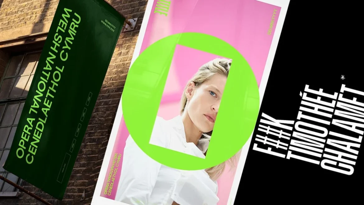
The arts world, often perceived as a realm of hushed reverence and tradition, found itself unexpectedly thrust into a public discourse sparked by a casual remark from a prominent Hollywood actor. Timothée Chalamet, during an interview earlier this year, declared that "nobody cares about opera and ballet anymore." While this sentiment might have been intended as a fleeting observation, it has inadvertently galvanized a sector often grappling with perceptions of elitism and declining relevance, prompting a renewed determination to showcase the enduring vitality and contemporary appeal of these classical art forms. Far from being disheartened, opera and ballet companies are seizing this moment as an impetus for reinvention, evident in strategic rebranding efforts and a renewed push for artistic innovation.
Seattle Opera’s sophisticated response to Chalamet’s comments was an early indicator of this emergent resilience. However, across the Atlantic, the sentiment behind the actor’s words became a direct catalyst for the Welsh National Opera’s (WNO) ambitious new branding initiative. As the WNO approaches its landmark 80th anniversary, the organization sought not merely to counter Chalamet’s assertion but to fundamentally redefine its public image. The goal was to forge a progressive, contemporary identity that would imbue opera with "the energy of an electric night out," challenging the stereotype of the art form as staid or inaccessible.
A Bold New Identity: The "O Frame"
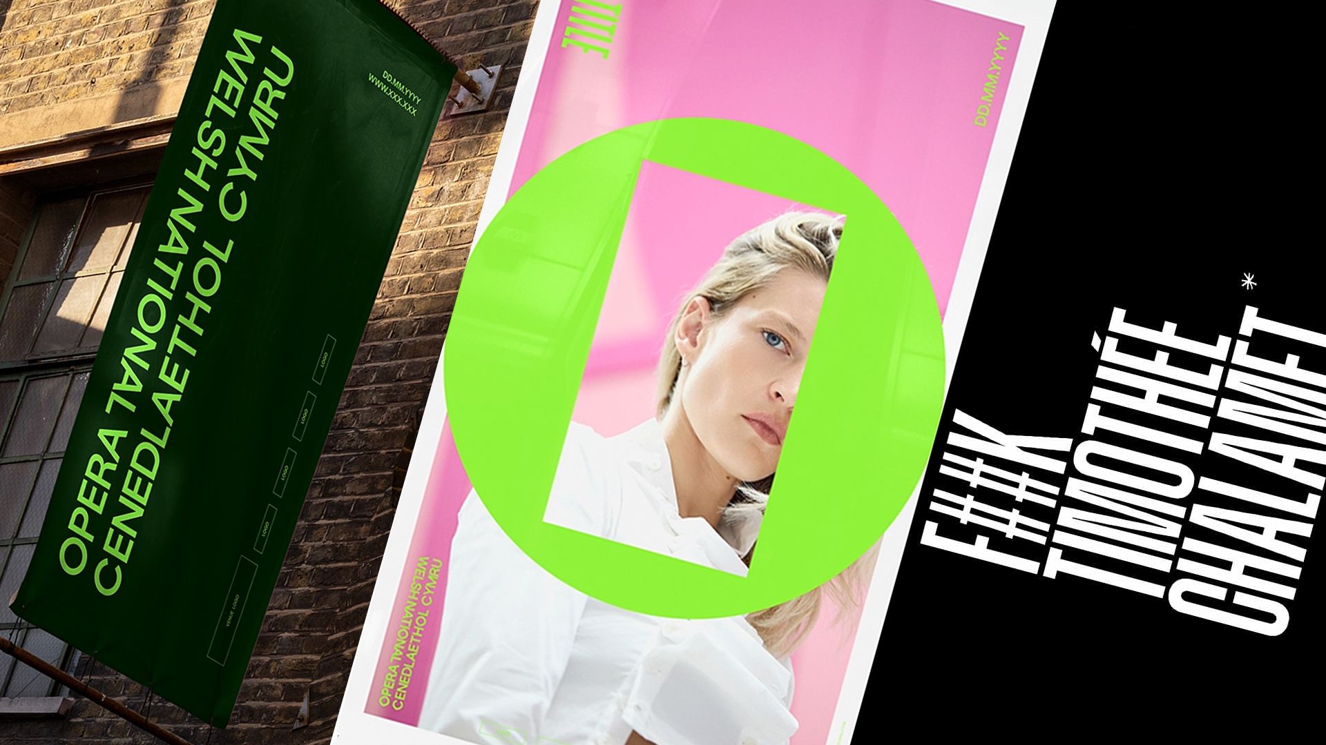
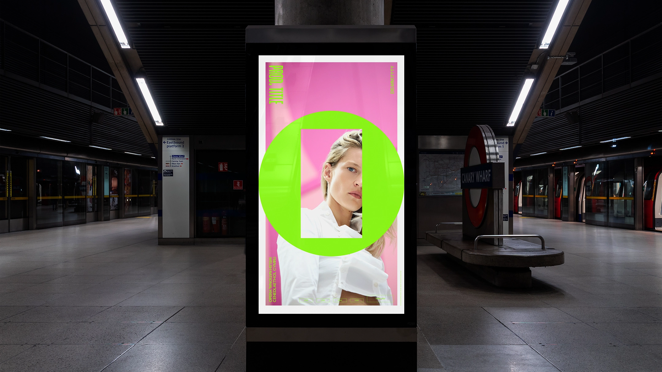
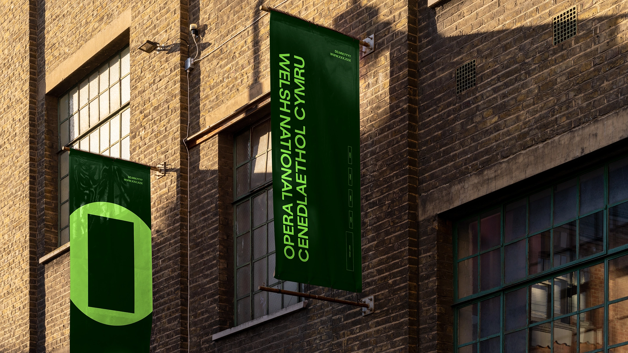
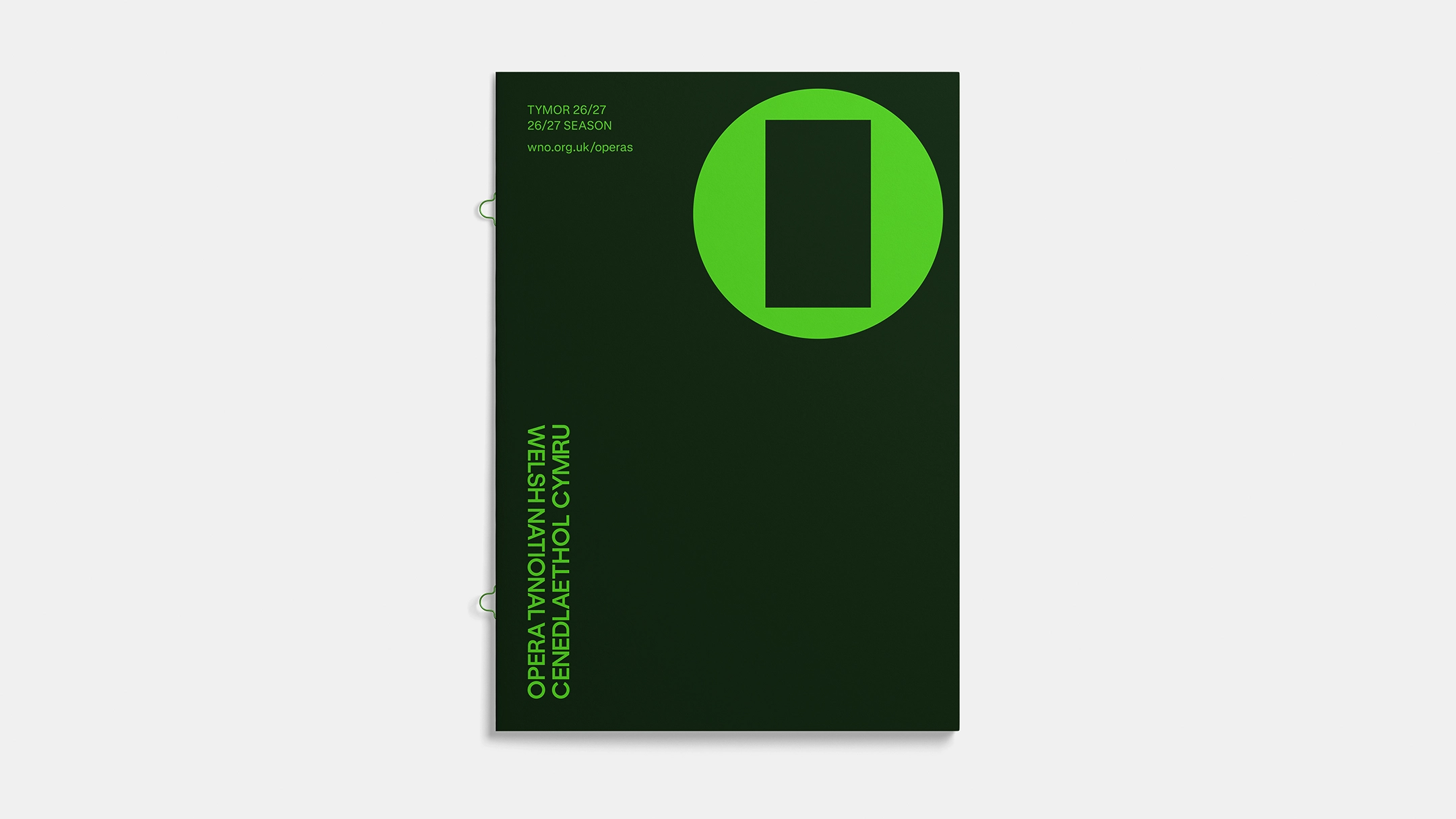
The ambitious rebranding project was undertaken by Bwtic, a Welsh design studio renowned for its innovative approach to visual communication. Bwtic’s objective was to reassert the WNO’s cultural authority and to signal a significant shift in its artistic vision. At the core of this striking new identity lies a minimalist yet potent symbol: the "O Frame." This distinctive mark is elegantly simple, comprising an outer circle representing the opera as a whole, enclosing an open rectangle at its center.
Bwtic articulated the conceptual genesis of the O Frame as a direct response to "the frustration that Opera is too often seen as one particular story told in one particular way." Instead, the O Frame is designed to embody opera as a dynamic platform for a multitude of narratives. The outer circle signifies the enduring medium and art form of opera, a vast and rich tradition. Within this, the inner frame acts as a crucial element, symbolizing each individual production. This inner space is deliberately left open, representing the unique story, subject matter, message, and point of view that each opera brings.
The intentional "dissonance," as Bwtic describes it, between the circular outer form and the rectilinear inner frame – the juxtaposition of "square pegs and round holes" – is a deliberate design choice. This visual tension is intended to communicate that opera, while a unified art form, is inherently diverse and capable of encompassing a wide spectrum of human experience and artistic interpretation. It challenges the notion of a singular operatic narrative, asserting instead the art form’s capacity for constant evolution and adaptation to contemporary themes.
Celebrating Bilinguilism: A Forward-Thinking Wordmark
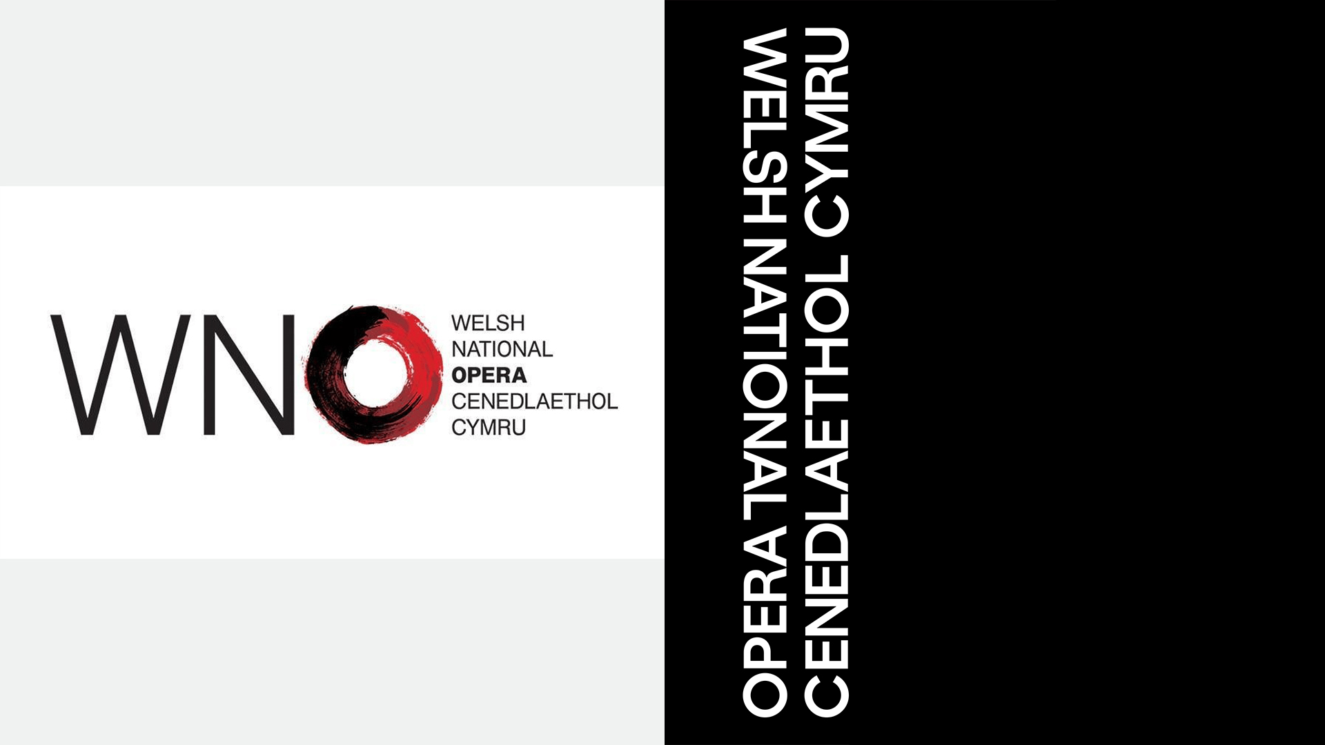
Complementing the O Frame is a sophisticated bilingual wordmark, meticulously designed to give equal prominence to both Welsh and English. This design choice is deeply rooted in the cultural landscape of Wales and reflects a thoughtful approach to inclusivity. The studio’s stated intention is that "the eye of the reader that finds their own language first."
This linguistic inclusivity is not merely a design flourish but a deliberate statement about the WNO’s identity and its relationship with its audience. Historically, Welsh organizations have often navigated the complexities of balancing Welsh and English, striving for an equitable representation. Bwtic’s new logotype elegantly addresses this by creating a dynamic visual experience where both languages are immediately visible, allowing individuals to connect with the brand through their preferred linguistic lens. This approach underscores the understanding that opera, like language, is a powerful tool for connection and understanding, capable of transcending linguistic barriers.
The studio’s commentary on this aspect is particularly insightful: "Opera is an art-form that has always been comfortable with interchanging languages. Welsh organisations have often struggled to find balance between the Welsh and the English language; eager to avoid any bias. In our new logotype, it is the eye of the reader that finds their own language first." This highlights a nuanced understanding of cultural identity and the power of design to foster a sense of belonging and accessibility.
Typographic Roots: A Nod to the Past, A Vision for the Future
The typographic elements of the WNO’s new branding also carry significant historical weight. Bwtic delved into the organization’s archives, drawing inspiration from a 1946 poster that promoted the opera company’s inaugural production. This historical artifact featured a bold, condensed, uppercase sans-serif typeface, characteristic of the era.
Bwtic’s redesign process involved developing a new typographic system that pays homage to this historical font while infusing it with contemporary relevance. The resulting typeface functions as a powerful and modern extension of the original font’s direct and authoritative voice. However, it has been meticulously crafted to offer a far greater degree of flexibility, making it suitable for a wide array of applications across both digital and print media. This adaptability ensures that the WNO’s visual identity remains consistent and impactful, whether it appears on a grand theatre banner, a social media post, or even, as the article humorously suggests, in "cheeky jibes at Hollywood actors."
This typographic revival speaks to a broader trend in brand identity design: the strategic use of historical elements to imbue a brand with a sense of legacy and authenticity, while simultaneously modernizing its aesthetic to resonate with contemporary audiences. It’s a delicate balancing act that Bwtic has masterfully achieved, creating a visual language that is both rooted in tradition and forward-looking.
The Broader Context: A Cultural Reckoning?
Chalamet’s comments, though perhaps flippant, tap into a larger, ongoing conversation about the accessibility and perceived relevance of classical arts in the 21st century. Data from various cultural institutions often reveals challenges in attracting younger and more diverse audiences to traditional opera and ballet performances. Factors contributing to this include high ticket prices, the perceived complexity of the art forms, and a lack of representation in narratives and on stage.
However, these challenges are not insurmountable. Numerous organizations have been actively experimenting with innovative programming, digital outreach, and community engagement initiatives to broaden their appeal. Seattle Opera’s response, for example, was not just a PR stunt but a demonstration of a willingness to engage with public perception and articulate the value of opera in a modern context. Similarly, the WNO’s rebrand is more than just a new logo; it represents a strategic investment in redefining its brand narrative and signaling a commitment to artistic evolution.
The implications of such rebranding efforts extend beyond mere aesthetics. A strong, contemporary brand identity can attract new talent, both on and off stage, foster stronger partnerships, and ultimately, increase audience engagement. By presenting opera as an "electric night out," the WNO is not diminishing its artistic merit but rather highlighting its potential for dramatic impact, emotional resonance, and vibrant performance. This approach acknowledges that the core elements of opera – compelling storytelling, powerful music, and virtuosic performance – are timeless and can indeed be presented in ways that captivate a modern audience.
The Enduring Power of Opera and Ballet
The notion that opera and ballet are in terminal decline is a narrative that has been perpetuated for decades. Yet, the persistence and adaptability of these art forms suggest otherwise. The sheer dedication required from performers, the intricate craftsmanship involved in productions, and the profound emotional and intellectual experiences they offer continue to draw dedicated artists and audiences alike.
The current surge in efforts to modernize and revitalize these art forms is not a sign of weakness but of inherent strength and a commitment to survival and growth. The WNO’s rebrand, in particular, serves as a powerful case study. By embracing a bold, contemporary visual language, the organization is not abandoning its heritage but rather recontextualizing it for a new era. The O Frame, with its emphasis on diverse narratives and the "dissonance" of different elements coming together, perfectly encapsulates the potential of opera to reflect and engage with the complexities of the modern world.
As the Welsh National Opera embarks on its next chapter, its new identity stands as a testament to the enduring power of artistic expression and the strategic importance of adapting to evolving cultural landscapes. The conversation ignited by Timothée Chalamet, while perhaps unintentional, has undeniably served as a catalyst, prompting a vibrant and necessary reassertion of the relevance and excitement that opera and ballet continue to offer. The art world is watching, and the message is clear: opera and ballet are far from fading into obscurity; they are actively reinventing themselves for the future.
