
The recent conclusion of another Red Nose Day serves as a potent reminder of the profound influence color wields in shaping brand recall and emotional connection. While the iconic red nose itself has undergone various iterations since its inception, its enduring simplicity underscores the remarkable capacity of a single color to achieve cultural symbolism. Beyond this prominent example, the broader landscape of the charity sector offers a compelling case study in the strategic and creative deployment of color. Operating with often limited resources, charities have honed a distinct approach to branding, prioritizing restraint and impactful simplicity to forge deep connections with their supporters. Instead of chasing fleeting trends or investing in costly brand overhauls, these organizations have cultivated instantly recognizable visual identities where color, or even its deliberate absence, plays a pivotal role in their communication strategy.
The Strategic Imperative of Color in Non-Profit Branding
In the highly competitive arena of charitable giving, where numerous organizations vie for public attention and financial support, a strong and consistent visual identity is not merely an aesthetic choice but a critical strategic asset. Research consistently highlights color as one of the primary elements that consumers recall about a brand, underscoring its significance for any organization seeking to establish a lasting presence, particularly within the non-profit sector. Charities, often constrained by tighter budgets and less frequent advertising opportunities than their for-profit counterparts, cannot afford to overlook this fundamental aspect of brand building. Their success in achieving widespread recognition and fostering trust hinges on the strategic leverage of color to create cohesive and memorable visual narratives.
The effectiveness of this approach is vividly illustrated by the deep-seated associations many charities have forged with specific colors. These associations transcend mere visual identification; they become powerful conduits for conveying the organization’s mission, values, and emotional impact. For instance, the vibrant yellow synonymous with Pudsey Bear and BBC’s Children in Need has evolved to embody the charity’s spirit of optimism, comfort, and the inherent value of childhood. This hue has become a beacon of hope and support for countless children and families.
Similarly, the soft yet resonant shade of light pink is now inextricably linked with Breast Cancer Awareness campaigns. This color, often associated with gentleness, has been strategically employed to evoke feelings of strength, resilience, and the persistent pursuit of hope in the face of adversity. The choice of pink has facilitated a powerful emotional connection with those affected by the disease and has become a rallying symbol for research and support.
The Marie Curie Foundation masterfully employs a dual-color strategy, pairing a calming blue with the cheerful vibrancy of daffodil yellow. This combination effectively communicates both the trust and compassion inherent in their care for families facing terminal illness. The blue suggests reliability and steadfastness, while the yellow symbolizes the warmth, hope, and brighter days they strive to bring to those in their care. This thoughtful pairing ensures that their visual identity reflects the multifaceted nature of their support.
These deeply ingrained color associations are not the product of chance; they are the result of meticulous planning, unwavering consistency, and a profound understanding of color psychology. Building such a powerful link between a charity and a specific hue requires more than just periodic use. It necessitates a sustained and deliberate reinforcement of the chosen color across all touchpoints, ensuring that it authentically mirrors the organization’s core mission and values. This consistent application allows the color to become a shorthand for the charity’s identity, eliciting immediate recognition and emotional resonance among its audience.
The Genesis of Iconic Charity Colors: A Look at Red Nose Day and Children in Need
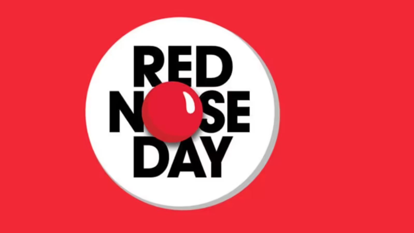
The genesis of Red Nose Day, a flagship fundraising event for Comic Relief, can be traced back to 1985 when a group of comedians launched a televised appeal. The simple yet effective idea of wearing a red nose, a symbol of lightheartedness and silliness, quickly captured the public imagination. This initial campaign, broadcast across the UK, aimed to raise money for people living in extreme poverty and hardship. The red nose, a universally recognizable symbol, provided an accessible and engaging way for individuals to participate and show their support. Over the decades, Red Nose Day has evolved into a national phenomenon, characterized by widespread public participation in fundraising events, elaborate television specials featuring celebrity involvement, and a pervasive cultural presence. The iconic red nose, while adapting in design, has remained the central visual motif, demonstrating the enduring power of a single, bold color to define an event and its charitable cause.

Similarly, Children in Need, a charity established by the BBC in 1980, adopted Pudsey Bear as its mascot. Pudsey, a bright yellow bear with a distinctive bandage over one eye, has become an instantly recognizable figure. The choice of a bright, cheerful yellow for Pudsey was likely deliberate, aiming to evoke feelings of warmth, happiness, and childhood innocence. The yellow hue creates a positive and approachable image, encouraging children and adults alike to engage with the charity and its mission to help disadvantaged children and young people across the UK. The annual Children in Need telethon, a cornerstone of the charity’s fundraising efforts, consistently features Pudsey prominently, reinforcing the association between the color yellow and the organization’s commitment to supporting vulnerable youth. The consistent presence of Pudsey and his signature color across various media platforms, from merchandise to fundraising materials, has cemented yellow as a powerful symbol of hope and support within the charitable landscape.
The Psychology of Color in Brand Association
The impact of color on human perception and emotion is a well-documented phenomenon, deeply rooted in psychology and cultural conditioning. Colors can evoke a wide spectrum of feelings, associations, and even physiological responses, making them potent tools in brand communication. For charities, understanding and harnessing this psychological power is crucial for establishing an immediate and meaningful connection with their target audiences.
Red, for instance, is a color of immense power and duality. It can signify passion, love, and urgency, making it ideal for campaigns that aim to elicit strong emotional engagement or immediate action. However, red can also be associated with danger or aggression, necessitating careful consideration of context and application. In the case of Red Nose Day, the use of red is overwhelmingly associated with fun, celebration, and a call to action for a good cause, effectively overriding any potentially negative connotations.
Blue is frequently perceived as a color of trust, stability, and calm. It is often employed by financial institutions and healthcare providers to convey reliability and professionalism. For charities like Marie Curie, the use of blue can reinforce a sense of dependable support and compassionate care. The specific shade of blue can further refine these associations, with lighter blues evoking tranquility and darker blues suggesting depth and authority.

Yellow, as seen with Children in Need, is widely associated with happiness, optimism, and warmth. It is a color that can brighten moods and evoke feelings of cheerfulness. This makes it an excellent choice for charities focused on children or those aiming to convey a message of hope and positivity. The bright, energetic nature of yellow can make a brand highly visible and memorable, attracting attention and fostering a sense of approachability.
The effectiveness of these color choices is amplified by their consistent application across all brand touchpoints. When a charity consistently uses its designated colors in its logo, website, marketing materials, fundraising events, and even staff uniforms, it builds a powerful and enduring visual identity. This repetition reinforces the association in the minds of the public, making the color a mental shortcut to the organization and its mission. This deliberate and sustained use of color is a cornerstone of effective branding, enabling charities to cut through the noise and connect with their supporters on a deeper, more emotional level.
The Power of Consistency: Building Trust Through Repetition
In the realm of branding, consistency is not merely a desirable trait; it is the bedrock upon which trust and recognition are built. For charities, this principle holds even greater significance, as their very existence depends on the faith and support of the public. The strategic use of color, when applied with unwavering consistency, becomes a powerful mechanism for cultivating this essential trust.
Unlike many commercial brands that may undergo periodic rebranding or shift their marketing strategies in response to market trends, charities often maintain a more stable visual identity. This is partly due to resource limitations but also reflects a deliberate choice to foster a sense of enduring reliability. Charities typically operate with a long-term vision, aiming to build lasting relationships with their donors and beneficiaries. Their chosen color palette, therefore, becomes a vital constant, a familiar anchor in an ever-changing world.

The impact of this consistency is profound. When individuals encounter a charity’s signature color – whether on a collection tin at a local shop, a banner at a fundraising event, a social media post, or a television appeal – it triggers an immediate sense of familiarity and reassurance. This repeated exposure to the brand’s color reinforces its presence and mission in the public consciousness. It signals that the organization is stable, dependable, and committed to its cause. This familiarity breeds comfort, making potential donors more inclined to engage and contribute.
Furthermore, this consistent visual language helps to differentiate a charity from the myriad of other organizations seeking attention. In a crowded marketplace, a distinctive color palette acts as a beacon, guiding potential supporters towards the cause they wish to champion. This is particularly crucial for smaller charities or those operating in niche areas where widespread brand awareness might be a significant challenge.
The concept of "owning" a color, where a specific hue becomes so intrinsically linked to a brand that it is almost impossible to separate them, is a testament to the power of sustained consistency. Brands like Coca-Cola with its iconic red, or Tiffany & Co. with its distinctive "Tiffany Blue," have achieved this through decades of deliberate and consistent brand messaging. Charities, though often operating with different objectives and budgets, can achieve a similar level of color ownership through disciplined application and a clear understanding of their brand’s core identity. This strategic approach to color not only enhances recognition but, more importantly, builds a foundation of trust that is indispensable for the long-term success of any charitable endeavor.
The Broader Implications: Lessons for All Brands
The success of charities in leveraging color for impactful branding offers valuable lessons for a much wider audience, including for-profit businesses facing similar challenges in today’s crowded marketplace. In an era characterized by shrinking attention spans, budget constraints, and an unrelenting demand for relevance, commercial brands can learn immensely from the strategic discipline and emotional resonance achieved by non-profit organizations.

For many established brands, color is not merely an aesthetic choice but a deeply embedded brand asset that has accumulated significant equity over time. Think of the instantly recognizable Coca-Cola Red, the sophisticated Tiffany Blue, or the playful Barbie Pink. These iconic hues were not selected on a whim or based on fleeting fashion trends. Instead, they were chosen because they authentically express the essence of the brand and evoke the specific emotions the brand aims to elicit in its audience. When a brand’s color genuinely reflects its core purpose and is supported by a well-defined strategy, it possesses the power to foster profound recognition and connection.
The principles that underpin successful charity branding through color are universally applicable. They highlight that timeless and impactful branding can be achieved not necessarily through exorbitant spending, but through strategic insight and unwavering commitment. By meticulously selecting a color that encapsulates the brand’s DNA – its core values, mission, and personality – and by employing that color with consistent intent over an extended period, any brand can cultivate vital associations. These associations not only enhance visibility and memorability but, more importantly, forge an emotional resonance with their target audiences, fostering loyalty and driving engagement.
The lessons learned from the charity sector underscore a fundamental truth in branding: color is a potent emotional amplifier. When wielded with purpose and consistency, it transcends mere visual appeal to become a powerful narrative tool, capable of communicating complex ideas and forging deep, lasting connections. As the marketing landscape continues to evolve, the strategic deployment of color, as exemplified by leading charities, remains a cornerstone of effective and enduring brand building.
The question of which colors resonate most strongly with charitable causes invites ongoing discussion and personal reflection. For many, the vibrant yellow of Children in Need or the determined pink of breast cancer awareness immediately spring to mind. These associations are not accidental; they are the carefully cultivated fruits of strategic branding, demonstrating that with thoughtful planning and consistent execution, color can indeed be a powerful force for good, driving both awareness and meaningful action.